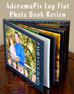
 I’ve made lots of photo books in the last few years, but I’ve never made a book that was printed on real photo paper. So when I was invited to try out and review Printique, I was very interested in checking them out, especially when I saw that not only do they print with silver halide photo paper, but all their books feature lay-flat pages.
This was especially perfect timing because I finally launched my new video course on taking family portraits and it was a good opportunity for me to print some of the portraits I took for the course.
Online Photo Book Editor
Printique offers photo books in 16 sizes including portrait, landscape, square, and panoramic designs in hardcover or leather. All are printed on silver halide paper and all have pages that lat flat with no gutter in the middle.
Their online photo book tool is called PixPublisher and using it is about as simple as could be. To set up your book you choose your cover style, size, and shape and select from five different paper options (more on these options in a moment). Then you can either select a pre-designed, customizable theme, create your own layout entirely, or upload your pre-designed book in PDF format.
Before I uploaded my images to the bookmaker, I edited them in Lightroom and put them in a collection. That helped me keep organized, and then I was able to import them right from Lightroom using a free plugin. You can also import images from your computer, Flickr, Google+, Facebook, Smugmug, Phanfare, Photobucket, and Instagram, or use a free plug-in to export from Aperture, or iPhoto. My images uploaded very quickly. You can upload JPEG or TIFF files, with a maximum file size of 60 MB. If you work frequently with extremely large files there is an upgrade from the free service to a premium plan that allows up to 200MB images, PDF previews, and other benefits.
Below is the workspace in the book editor. You just drag and drop images, backgrounds, page layouts, and stickers onto the page. You can also use the auto-fill feature and your images will automatically be put into layouts, and then you can make any adjustments you want.
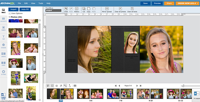
The workspace is pretty flexible, though the area on the left where your thumbnails and page layout options are takes up a fair amount of space. You can adjust a slider to increase or decrease the viewing area so you can zoom in to check the alignment, for example. The design tools are quite comprehensive; you can move and re-size or add/delete anything on the page, adjust the text letter spacing and line spacing and there are 80+ fonts.
One of my favorite features is the ability to adjust the transparency of an image so you can use a photo as a background and reduce the opacity. You can even adjust the transparency of the stickers — there are some 6000 of them. I also love the unlimited Undo feature and the ability to look at your history and go back to a previous state. In addition to the unlimited solid color background choices and 1200+ patterned backgrounds, you can create a custom color gradient. There is also an option to choose global settings for font, font color, image, and sticker border/shadow and background.
Other features I liked:
- I can drag an image onto a page and click “fit page” and span it across the whole 2-page spread.
- You can order your images by newest or oldest, A-Z or Z-A, unused on top or custom sorting (drag and drop in the order you want).
- You can choose to show or hide the images you’ve already used.
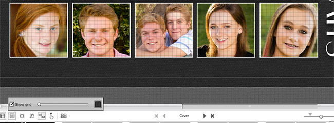
- Images can be snapped to the grid and you can show or hide the grid lines. You can also have moved elements snap to each other.
- The two-page spread can be flipped (mirror spread)
- With one click you can select all elements on a page.
- Using Properties, you can view and precisely adjust the image height/width to the pixel or adjust the x/y location.
What I’d Like to See:
On my wish list is the ability to quickly align images to each other. For example, on my cover, I had five small square images in a row and I wanted equal spacing between them. The only way to do this was manually, according to Customer Service, by zooming in and using the grid. I’d prefer to be precise rather than eyeballing it.
Also on my feature wish-list is are a few more themes, especially more travel themes (there are just three). While I like to do my own thing, many people like to start with a pre-designed theme to help them get started. There are about 66 themes at this writing, though the ones available are well-designed and attractive. A number of pros use Printique for their portfolios and there are some nice, simple designs that show off the images well.
One thing to be aware of: you cannot make edits or enhancements such as contrast or color adjustments to the images from within the PixPublisher book editor. This you would need to do in your own image editing program before you upload your photos.
Book Quality
 Thick Pages
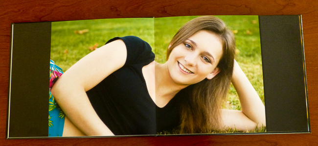
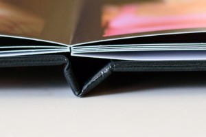
So enough about the software and ordering, what you really want to know is what the quality is like. When I received my book the first thing that struck me was how thick the pages are. They’re super thick, like card stock. My understanding is that it’s two pieces of photo paper glued together, so they flex but they’re by no means flimsy and they won’t easily bend or curl.
And I love the lay-flat pages. They are single, unbroken sheets of photo paper, all you have is a bend where the page folds. There’s absolutely no gutter in the middle, so nothing gets lost in the center. It was ideal for the two-page spread I did in my family portrait book.
Amazing Color
The color reproduction in my book is beautiful. I chose the standard photo paper, the Lustre, which has a slight sheen. My images came out rich and vibrant with great flesh tones. They almost jump off the page. A couple of images do look darker than they did on my screen, but it’s not enough to be a problem. Overall, the images look good enough to frame and put on my desk or wall. There’s none of the graininess or “dots” that you often get with other photo books. Now I’m spoiled.
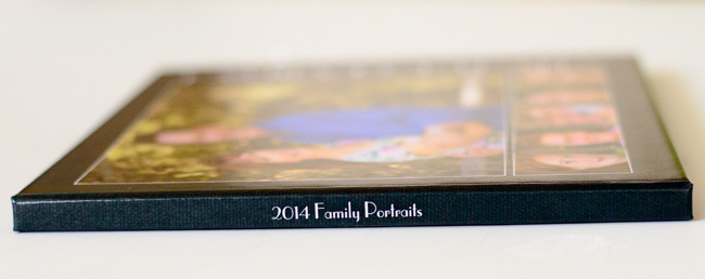
I chose the Hard Cover and the finish is kind of between shiny and matte. So it has a nice sheen but it’s not super shiny nor is it dull. I rather like it, though it does show fingerprints in the black background area. The binding appears to be solid and all the pages were properly aligned. You can get free endpapers if you choose to have the logo on the inside back cover, or you can pay an extra $2 for end sheets and no logo. I like that there is a no-logo option.
Price-wise, the books are not inexpensive but the quality makes them a good value. There are a few other companies that offer lay-flat photo books printed on real photo paper. A 20-page 8×10 hardcover book costs about $42 without a sale, though the company does offer fairly frequent sales.
The order processing is fast. Printique’s website states that the average processing time is 3 days. Mine was even faster. I ordered my book on Wednesday, it shipped Thursday and I received it Saturday.
The Specs
Book Sizes
Printique offers 16 book sizes:
| Portrait | Landscape | Square | Panoramic |
| 6×4.5, 8×6, 10×8, 12×6, 12×9 | 6×7.5, 6×9, 8×10, 8×12, 10×12.5, 12×15 | 6×6, 8×8, 10×10, 12×12 | 12×6 |
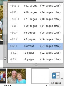 One thing that’s a little unusual is the way you add new pages to the book. You can have a minimum of 10 and a maximum of 76. When you first create your book the default for the 8×10 book is 14 pages and I could add pages as +2 pages, + 4 pages, – 2 pages, – 4 pages, etc. For example, if you start with 14 pages and you want 20, you have to click on “+4 pages” and then “+2 pages” rather than simply adding 6 pages. But you get there eventually.
Paper
There are six paper options, all are archival-quality, fade-resistant photo paper with lay-flat pages:
- Luster – the standard paper with a slight sheen
- HD Glossy – high shine
- Luster Linen
- Luster Pebbled
- Deep Matte – least amount of sheen
- Silk Finish – high-end paper that gives images a soft, cloth-like feel. Would be beautiful in wedding photos and portraits.
Photo Book Covers
In addition to the Hard Cover image wrap, there is a choice of real Italian leather in 4 colors or Leather Luxe in 10 colors. Both can be stamped in gold or silver foil or debossed gold/silver. These are premium flush-mounted photo albums with thick, non-bendy pages and gilded edges, making them ideal for wedding albums, and they are well-priced compared to some other sites.
Bottom Line
While mass-market photo books certainly have their place, and I’ve made my share of them, when you want to make a special book, such as a wedding album or portfolio or even a special vacation photo book, Printique offers beautiful quality and choices most other online photo book printers don’t have. To help you keep the cost down, check my coupon page where I post the latest coupon codes for Adoramapix and other photo companies.
The company also offers photo prints, metal, canvas, and acrylic prints, collages, and mounted photos, plus greeting cards and calendars.
Have you tried Printique for photo books or prints? How did your project come out? Leave a comment below and tell me what you think.

