 It’s almost November and I’m already thinking about making my Christmas photo card. I just love giving and receiving photo cards for the holidays, it’s so much more personal than a generic store-bought card and can actually be very reasonably priced.
By planning now – taking my photos and choosing my card design – I will have a jump start on the holiday rush. Best of all I will be able to take advantage of all the big card sales that I KNOW are coming from companies like Shutterfly, Snapfish, Mixbook, My Publisher and others. BTW, that’s my secret to never paying full price for my cards! The card deals usually only last a few days before expiring, so it helps to have already planned out my card so I don’t have to rush.
One thing I love to do is play with the card designs and try out a bunch of different ones – another reason to start early because I experiment with lots of different designs and layouts before I narrow down my choices and create my final card.
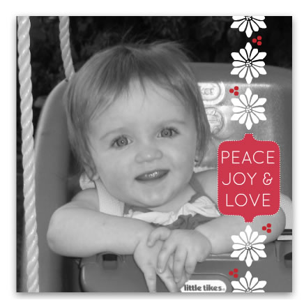
Sometimes to save money I have picked a flat photo card because they are very reasonably priced, often between 40 and 70 cents each. But I really like using folded cards so I can maximize the space and include more photos. If you catch a good sale, you can get a pretty good bargain. Plus, there are some really beautiful designs available and the paper quality I have found at Mixbook and My Publisher in particular makes a very elegant card. Below is a photo of my adorable niece in a black and white layout from Mixbook.
Narrowing Down Choices
 When you go to a site like Shutterfly
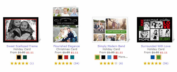
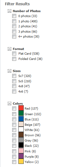
 that offers 600+ card holiday card designs or Mixbook with nearly 600 choices, it can be a little overwhelming. Where do you start looking for your design? These sites and others allow you to search by criteria such as number of photos, flat or folded card, card size, paper type (card stock or photo paper for example) and style. Most sites offer a range of styles and themes from classic to modern, religious, vintage and include Christmas, New Year, Hanukkah and general “season” designs. Some sites also let you refine your choices by color and price level as well as photo orientation. Shutterfly also has a new rating system whereby customers can rate the designs.
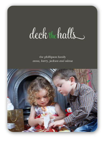
Snapfish and My Publisher
also offer new card designs with rounded corners and square designs. Here is an example of one cute card with rounded corners from My Publisher:
Layout Tips:
Tip #1: Before you select your card design, look at the image(s) you plan to use on the cover. Examine the composition. Is there room for text or design at the top or bottom, or will it obscure something important, like your smiling face?
Below is an example: In the first layout the little boy is blocked by the red banner. The second layout is a better choice since there is little “dead space” in the image for text. A third alternative is a vertical design using more of the lower end of the image so the kids don’t get cropped as much.
Tip #2: When filtering cards by “number of photos” it usually refers to the number on the cover only. Oftentimes there are spots on the inside as well as the back cover where you can place addition photos. I think it’s nice to do a photo collage on the inside cover.
Tip #3: If you don’t want to use all the photo boxes inside or on the back, you can leave them empty and the card will print with that area left blank. Mixbook allows you to customize everything, and I mean everything, so you can add or remove photo or text boxes anywhere on the card.
Tip #4: Often within a card design there are several color choices. Experiment with different colors. Maybe changing from the original green you chose to blue will make your photos pop.
Tip #5 – Edit your photos. Is there something distracting in the background that should be removed? Do the colors or exposure need adjusting? What about red-eye? I recommend you make all edits first in your editing software. While some companies offer basic editing like exposure or red eye removal, you won’t be able to do much else. I like Photoshop Elements for this. Their content-aware fill tool is awesome for removing unwanted backgrounds.
After you winnow down your design options and edit your photos, start playing with them. Upload some photos. Nowadays you can usually upload photos from a variety of places besides your computer, like Facebook, Flickr, PhotoBucket, Picasa, Smugmug, and even Instagram.
You can change the fonts, swap out the font color, and, if you are using Order personalized cards at Mixbook, move photos and text around and add different backgrounds or stickers. Or if you want to be quick about it, Mixbook has a new 30-second card editor. I tried it and it really is fast, but of course you need to already know what design you want to use. Then you just drop in your photo(s), add your text and order.
So, time to get thinking about either taking new photos or going through your collection for the year and selection your favorites for your holiday card. To save money on your photo cards so you have a little extra for those all-important Christmas presents, be sure to visit my photo sales page to get the latest coupon codes and promos.

