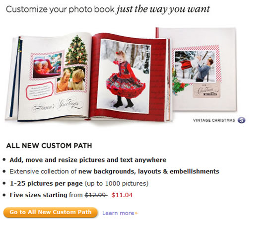
A few months ago Shutterfly updated its Custom Path for creating photo books online. On one hand, they added some cool new options like more scrapbook-like designs and embellishments, yet on the other hand some users feel the changes make them more restricted instead of giving them more creative freedom. Is that true? Let’s take a look at what’s new.
Many people like to create a big Year in Review album covering a variety of topics ranging from holidays like Easter and Halloween, sports, school events, birthdays, anniversaries, vacations, etc. They like to use various themes and embellishments throughout the book, pulling different backgrounds and stickers from different themes to fit the event they are documenting and not be limited to the choices within one book style. With the “old” Custom Path this was easy to do. With the new one, at first glance it appeared that you were limited to the initial style you chose and some users were upset. Part of the reason why many people used Shutterfly to make their photo books was because they offered so much customization. Was this a step backward?
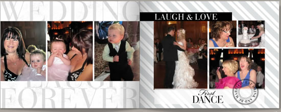
It so happened that I wanted to make a photo book of my own to document a family wedding I attended in Canada last summer (yes I am quite the procrastinator). So I started my new Custom Path book. While I have looked at the new features since they were implemented I hadn’t actually made a new book since I did an earlier review. It turns out you can still use backgrounds and stickers from other themes. You do need to pick an initial style for your book, but then in the editor you can access different elements. On the left side of the photo book editor screen, there is a text link that says “get more backgrounds.” This gives you access to hundreds of other backgrounds that you can add to your project. You can find them by style, occasion, category, color or collection. Likewise, if you want to use stickers from another theme, on the stickers menu just click the “Get more stickers” link at the bottom and you can add additional stickers. The new process does seem slower, however, because these elements are not already there in your menu to choose from, you have to take an extra step.
However there are many great features that offer a large deal of customization and actually make things faster for you. There is an array of pre-designed themes you can tweak, and new ones are being added regularly. You can also start with a blank slate and do everything from scratch.
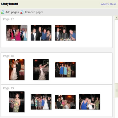 The Storyboard is a very helpful feature. You can organize your photos by grouping the ones you want to appear on each page and then the software will choose the best layout based on the images. Of course, you can change the layout if you don’t like it. I find the storyboard saved me a lot of time and I wouldn’t be without this feature.
Total Customization
Shutterfly is clearly trying to compete with Mixbook, which is known for its extensive customization. With its new features, Shutterfly is definitely getting closer. You get much of the control you would get in a PC or Mac-based design software program yet you get to do everything online without having to purchase expensive software. To use the customization tools you need to click on “customize page” in the bottom left-hand corner and when you are done you go back to the normal mode. So you will likely be going back and forth quite a bit if you like to customize, but it really isn’t a big deal. There is also an “undo” button that I used frequently. It can be a real time-saver to instantly go a step back.
Here are some highlights of the customization features :
Customize Page – You can change the photo or text box sizes and add, move or delete anything on the page. If you aren’t satisfied with the layout choices, just click on “Get more layouts.” You can get specialty pages like family tree, journaling, recipe, table of contents and others.
Align, Match, Space and Layer – If you are moving and resizing images be sure to use “align” to align the edges of your photos so they line up, if that is the look you are after. You can also match the size of an element, i.e. make a second image the same size as another, and equalize the space between them. I would love to see x-y coordinates and the ability to set guides like you can with regular design software, but the align function does work well. The Layers function gives you a lot of creative freedom to stack different elements on top of each other and rearrange the order.
Book-wide Settings
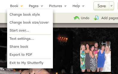 If you click on the down arrow below “Book” in the upper right corner of the editor, you have a number of additional options:
Change Book Style – You can change the book style to another theme, even mid-way through your project.
Change Book Size/Cover – If you change your mind, you can change the size of your book even after you started. It is easier to convert from a smaller size to a larger size, but I have also had success changing from an 8×11 to an 8×8 book. I did need to carefully go through each page and move some captions and there were occasions where I needed to change a layout to accommodate some photos because of their orientation. This feature also lets you choose a new cover and page type (standard or layflat pages). It will instantly price it out for you so you know what you are getting into before you apply the changes.
Globally Change Text – this is a handy feature and a good short cut. You can globally change the font style and size so you don’t have to individually change each page.
Share Book – You can share your book via email, add it to your share site on Shutterfly or post it to Facebook, Blogger or other sites.
Export to PDF – Another handy feature. You can convert your book to a PDF and print it out to proofread it and make sure everything is where and how you want it. The PDF will display “review” in giant letters across the page, so this is not meant for sharing, only proofing purposes. It is well worth spending the time on this extra step for proofing your project.
New Storytelling Styles
There are many more backgrounds and page elements to choose from than before, which can also slow you down, just from the sheer number of options. For example there are about 8500 stickers available. Choices, choices. These include embellishments from the new Storytelling Collection that gives you access to additional backgrounds and stickers at an extra cost. You can add elements individually for 25 cents each for unlimited use in a particular book. These a la carte styles have an “S” symbol beside them.
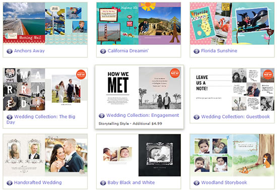
There are also new complete Storytelling themes that are premium styles for various occasions including travel, wedding, baby, holidays and other occasions. To use one of these premium themes it will cost you an extra $4.99 on top of the cost of the book. I was initially taken aback when I saw there was an extra cost. It seemed like nickel and dime-ing. But keep in mind these are optional and there are still numerous choices from their regular set of styles and themes. But if you want to check out the premium collection there are some very attractive styles that can make your photo book look like a real coffee table book. Below is a screen shot of some examples.
New Premium Books
For special occasions there are also several new premium photo book options: You can get, thick lay-flat pages that are seamless. These double-thick pages are professional-quality paper with a satin finish and would be ideal for a wedding book or art portfolio. They also now offers genuine leather covers with stitched edges, again, meant for the wedding book market and other occasions where you need a really high-end book. The premium books are available in 8×8, 8×11 and 12×12.
Quality
I have made a lot of photo books over the years with Shutterfly and have never been disappointed. The pictures print with good color reproduction. In fact, some of my iffy photos printed better than I expected. I have found the paper to be of nice quality, although they recently changed from 100lb paper to 65lb glossy paper. Some people might think changing to a “lighter” paperweight is a downgrade but I don’t see or feel much difference from before and the paper still seems to be very nice quality, though not quite as stiff as before. The finish is slightly glossy; the company is contemplating offering a matte finish sometime in the future. I still rank Shutterfly among the best for photo books and I love all the great deals they offer. For example, on this 8×11 book I made, I got 25% off on a sale and another 20% off on a second coupon I was able to stack on top. Most other companies only let you use one promo offer. To keep abreast of the latest deals, be sure to check out my coupons and promos page. If you aren’t currently a member of Shutterfly you can sign up free here.

